Lab 4: ggplot and Data Manipulation
Outline
Objectives
In this lab, you will learn how to:
- load R packages with
library() - subset data
- merge data
- visualize data with the grammar of graphics and
ggplot()aesthetic mappings
geometric objects
facets
scales
themes
R Packages
ggplot2
viridis
Data
- house prices
- county elections
Grade
For this assignment, you will complete a quiz as you work through the lab.
The Library
R is an extensible programming language, meaning you can write R code to extend the functionality of base R. To share that code, R users will often bundle it into a package, a collection of functions, data, and documentation. You can think of packages as apps, but apps specifically designed for R. To make the functionality a package offers available in R, you have to load them in with the library() function (the technical term is attach).
You should always, always, always load all the packages you use at the beginning of a document. That way, people who read your code know exactly what packages you are using all at once and right away. To make this really, really explicit, I prefer to put it with other front matter that I call the “R Preamble.” In an R Script, it looks like this:
### Lab 4: More Advanced R ###
# This code manipulates data and creates graphs using ggplot

setwd("G:/My Drive/Teaching/regression/02_assignments")

library(ggplot2)
library(viridis)
Of course, these aren’t just automatically on your computer, so you have to install the packages first. Then you can open them in R. To do that, you use the function install.packages(). For the packages used today, you can use this call just once like so:
install.packages(
  c("ggplot2", "viridis")
)
Note that you only need to run this once, so don’t put this as a line in your R script document, which you might render multiple times. Just run it in the console.
Exercises
Open a new R script and add the R Preamble with an R code chunk with the library calls that load the R packages required for this lab. Now actually run each library() call. You can do that by either highlighting them and hitting Ctrl + Enter (Cmd + Enter) or by clicking the run button. If you don’t highlight, R will run the code from the line your cursor is on.
Step 1: Load in the data
You should have already set up your working directory at the top of the sheet. In that folder, you should have the two datasets we will be using in this lab: “NBA_Data.csv” and “Five38_Data.csv”, which you can find on Canvas. Load them in using the read.csv() function.
NBA <- read.csv("data/NBA_Data.csv")
Five38 <- read.csv("data/Five38_Data.csv")
If you look in your environment, you should have two data frames. Explore the data a little bit using the functions head(NBA) and summary(NBA). You can use the same functions for the Five38 dataset.
The NBA dataset has statistics for all 30 NBA teams for the 2022-2023 season (updated to 2/13/2023), including wins, losses, total points, free throws, assists, turnovers, etc. It also includes whether the team was in the playoffs last year.
The Five38 dataset has the conference each team is in, plus the Five38 Elo predictions for whether the team will make playoffs, make finals, and win finals. It also includes the number of times each team has been in the playoffs since 1946.
Make a new column
You may notice that the NBA dataset has wins and losses, but it doesn’t have the win percent. We will make that ourselves! To create a new column, we just have to tell R what to do. Remember that we have to tell R which data frame we are using, then put a dollar sign to say we are accessing a specific variable.
NBA$win_pct = NBA$Wins/NBA$Games_PlayedEasy! We can explore this variable a little bit by typing:
summary(NBA$win_pct)Nice! Now we know that the median team lost about 50 percent of its games. Even the best team only won 72 percent.
Exercises
Make a new column that shows the average points per game, which is points (
NBA$Points) divided by the total games (NBA$Games_Played).Find the mean and median of points scored per game.
Use the
cor()function to find the correlation between points per game and the win percent.
Step 2: Merge data
To merge data, we need a unique identifier that matches between the two datasets, just like in any program. Take a look at the team names. What’s the problem?
The team names in the Five38 dataset are split to place and name. We can combine those columns using the following code:
Five38$Team <- paste(Five38$Place, Five38$Name, sep = " ")The paste function tells R that we are combining two strings. The sep = " " option tells R that we want a space between the two strings, but we could put a comma or no space if we wanted.
Now we have a unique ID, and we can use it to merge our datasets. We will create a new dataset called BBall with our merged data.
BBall <- merge(NBA, Five38, by = "Team")This new dataset has the same 30 teams, but 31 variables rather than 7 or 25. (It’s not 7 + 25 = 32 because R doesn’t repeat the identifier.)
Step 3: Subset Data
A common thing to do with data is subset the data into a smaller group of data. For instance, we might want to remove some columns if there are columns we don’t need. Or, we might want to do some calculations on only teams in the Western Conference. Or, maybe we want to do calculations on the teams that have over 50% win percent.
If we are subsetting the whole dataframe, we put square brackets next to the name of the dataframe and give it the [rows, columns]. For example, if we want the second row of the first column, we would type BBall[2,1]. If we want the entire 4th column, we would put BBall[,4]. And if we want the entire 8th row, we would write BBall[8,].
We can also subset a range of rows or columns. To get the first 5 columns, we would type BBall[,1:5].
To subset by the conference, we would use two equals signs to tell R that we are checking for equivalency. (One equals sign means we are assigning the value.) Let’s make a new dataframe that only includes the Western conference.
west <- BBall[BBall$Conference == "West",]Now, we could do whatever we wanted on the new “west” dataframe.
We don’t have to make a new dataframe to use functions. For example, let’s say we want the average number of rebounds for teams that have over a 50% win rate vs under or equal to a 50% win rate. We are going to call the mean function on rebounds. Since we are targeting just one column, we only have to put the row argument into the square brackets.
mean(BBall$Rebounds[BBall$win_pct > 0.5])
mean(BBall$Rebounds[BBall$win_pct <= 0.5])
Great! Now, let’s subset to find the mean number of turnovers for teams that are in the Eastern Conference and have at least 113 points per game. We will use the ampersand (&) to tell R that we want both conditions to be true to include it. We can compare that to the number of turnovers for teams in the Eastern Conference that have less than 113 points per game.
mean(BBall$Turnovers[BBall$Conference == "East" & BBall$points_per_game >= 113])
mean(BBall$Turnovers[BBall$Conference == "East" & BBall$points_per_game < 113])
We can also get columns by name. Let’s make a a new dataset that just includes the team name and our calculated columns.
new = BBall[,c("Team", "win_pct", "points_per_game")]One thing we might want to know is what the name of the maximum value is. We can use the function which.max(), which gives the position/row number of the biggest value. Then we can return that row number. For example, if we want to know which team has the biggest win percent we would use this code:
BBall$Team[which.max(BBall$win_pct)]Exercise
- What is the value in the 3rd row of the 9th column of the BBall dataset?
- What is the mean win percentage in the Western Conference?
- What is the average free throw percent for teams in the Western conference that have at least 1120 personal fouls?
- Which team has been to the playoffs the most times based on the “Times_in_Playoffs” variable?
Step 4: Create Visualizations
The Grammar of Graphics
It’s easy to imagine how you would go about with pen and paper drawing a bar chart of the number of games played in each conference. But, what if you had to dictate the steps to make that graph to another person, one you can’t see or physically interact with? All you can do is use words to communicate the graphic you want. How would you do it? The challenge here is that you and your illustrator must share a coherent vocabulary for describing graphics. That way you can unambiguously communicate your intent. That’s essentially what the grammar of graphics is, a language with a set of rules (a grammar) for specifying each component of a graphic.
Now, if you squint just right, you can see that R has a sort of grammar built-in with the base graphics package. To visualize data, it provides the default plot() function, which you learned about in the last lab. This is a workhorse function in R that will give you a decent visualization of your data fast, with minimal effort. It does have its limitations though. For starters, the default settings are, shall we say, less than appealing. I mean, they’re fine if late-nineties styles are your thing, but less than satisfying if a more modern look is what you’re after. Second, taking fine-grained control over graphics generated with plot() can be quite frustrating, especially when you want to have a faceted figure (a figure with multiple plot panels).
That’s where the ggplot2 package comes in. It provides an elegant implementation of the grammar of graphics, one with more modern aesthetics and with a more standardized framework for fine-tuning figures, so that’s what we’ll be using here. From time to time, I’ll try to give you examples of how to do things with the plot() function, too, so you can speak sensibly to the die-hard holdouts, but we’re going to focus on learning ggplot.
There are several excellent sources of additional information on statistical graphics in R and statistical graphics in general that I would recommend.
- The website for the ggplot2 package. This has loads of articles and references that will answer just about any question you might have.
- The R graph gallery website. This has straightforward examples of how to make all sorts of different plot visualizations, both with base R and ggplot.
- Claus Wilke’s free, online book Fundamentals of Data Visualization, which provides high-level rules or guidelines for generating statistical graphics in a way that clearly communicates its meaning or intent and is visually appealing.
- The free, online book ggplot2: Elegant Graphics for Data Analysis (3ed) by Hadley Wickham, Danielle Navarro, and Thomas Lin Pedersen. This is a more a deep dive into the grammar of graphics than a cookbook, but it also has lots of examples of making figures with ggplot2.
So, to continue our analogy above, we’re going to treat R like our illustrator, and ggplot2 is the language we are going to speak to R to visualize our data. So, how do we do that? Well, let’s start with the basics. Suppose we want to know if there’s some kind of relationship between the field goal percent and the probability of making playoffs. Here’s how we would visualize that.
ggplot(data = BBall) +
  geom_point(
    mapping = aes(x = Field_Goal_Pct, y = Making_Playoffs)
  )
Here, we have created a scatterplot, a representation of the raw data as points on a Cartesian grid. There are several things to note about the code used to generate this plot.
- It begins with a call to the
ggplot()function. This takes a data argument. In this case, we say that we want to make a plot to visualize the basketball data. - The next function call is
geom_point(). This is a way of specifying the geometry we want to plot. Here we chose points, but we could have used another choice (lines, for example, or polygons). - The
geom_point()call takes a mapping argument. You use this to specify how variables in your data are mapped to properties of the graphic. Here, we chose to map theField_Goal_Pctvariable to the x-coordinates and theMaking_Playoffsvariable to the y-coordinates. Importantly, we use theaes()function to supply an aesthetic to the mapping parameter. This is always the case. - The
labs()function allows us to specific axis lables and titles. In this instance, I’m only using it to create alternative text for accessibility. - The final thing to point out here is that we combined or connected these arguments using the plus-sign,
+. You should read this literally as addition, as in “make this ggplot of the basketball data and add a point geometry to it.” Be aware that the use of the plus-sign in this way is unique to theggplot2package and won’t work with other graphical tools in R.
We can summarize these ideas with a simple template. All that is required to make a graph in R is to replace the elements in the bracketed sections with a dataset, a geometry function, and an aesthetic mapping.
ggplot(data = <DATA>) +
  <GEOM_FUNCTION>(mapping = aes(<MAPPINGS>))
One of the great things about ggplot, something that makes it stand out compared to alternative graphics engines in R, is that you can assign plots to a variable and call it in different places, or modify it as needed.
playoffs_plot <- ggplot(data = BBall) +
  geom_point(
    mapping = aes(x = Field_Goal_Pct, y = Making_Playoffs)
  )

playoffs_plot
Exercises
- Recreate the scatterplot above, but switch the axes. Put win percent on the x axis and times in playoffs on the y axis.
- Now create a scatterplot of win percent on the x axis and probability of making playoffs (
Making_Playoffs) on the y axis.
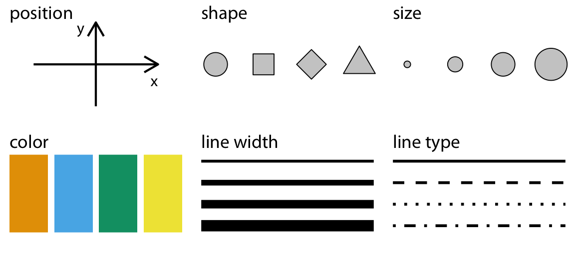
Aesthetics
In the plot above, we only specified the position of the points (the x- and y-coordinates) in the aesthetic mapping, but there are many aesthetics (see the figure below), and we can map the same or other variables to those.
Consider, for example, that we have two groups of teams: those that went to the playoffs last year and those that had no post season. Do we think that the relationship between the field goal percent and probability of making playoffs are the same for both? Let’s add conference to our aesthetic mapping (specifically to the color parameter) and see what happens.
ggplot(data = BBall) +
  geom_point(
    mapping = aes(x = Field_Goal_Pct, y = Making_Playoffs, color = Last_Year)
  )
Notice that ggplot2 automatically assigns a unique color to each category and adds a legend to the right that explains each color. In this way, the color doesn’t just change the look of the figure. It conveys information about the data. Rather than mapping a variable in the data to a specific aesthetic, though, we can also define an aesthetic manually for the geometry as a whole. In this case, the aesthetics do not convey information about the data. They merely change the look of the figure. The key to doing this is to move the specification outside the aes(), but still inside the geom_point() function.
ggplot(data = BBall) +
  geom_point(
    mapping = aes(x = Field_Goal_Pct, y = Making_Playoffs),
    shape = 21,
    size = 4,
    color = "darkred",
    fill = "darkgoldenrod1"
  )
Notice that we specified the shape with a number. R has 25 built-in shapes that you can specify with a number, as shown in the figure below. Some important differences in these shapes concern the border and fill colors. The hollow shapes (0-14) have a border that you specify with color, the solid shapes (15-20) have a border and fill, both specified with color, and the filled shapes (21-24) have separate border and fill colors, specified with color and fill respectively.

Note that you can use hexadecimal codes like #004F2D instead of “forestgreen” to specify a color. This also allows you to specify a much wider range of colors. See this color picker website for one way of exploring colors.
Exercises
- Change the code below to map the
Last_Yearvariable to the x-axis (in addition to the color).
ggplot(data = BBall) +
  geom_point(
    mapping = aes(x = Field_Goal_Pct, y = Making_Playoffs, color = Last_Year)
  )
What does this do to the position of the points?
Change the code below to map the
Last_Yearvariable to the shape aesthetic (in addition to the color).
# hint: use shape = ...
ggplot(data = BBall) +
  geom_point(
    mapping = aes(x = Field_Goal_Pct, y = Making_Playoffs, color = Last_Year)
)- Change the code below to map the
Last_Yearvariable to the size aesthetic (replacing color).
# hint: use size = ...
ggplot(data = BBall) +
  geom_point(
    mapping = aes(x = Field_Goal_Pct, y = Making_Playoffs, color = Last_Year)
)- For the following code, change the color, size, and shape aesthetics for the entire geometry (do not map them to the data).
ggplot(data = BBall) +
  geom_point(
    mapping = aes(x = Field_Goal_Pct, y = Making_Playoffs),
    color = , # <------- insert value here
    size = ,  # <-------
    shape =   # <-------
  )
Geometries
Have a look at these two plots.
Both represent the same data and the same x and y variables, but they do so in very different ways. That difference concerns their different geometries. As the name suggests, these are geometrical objects used to represent the data. To change the geometry, simply change the geom_*() function. For example, to create the plots above, use the geom_point() and geom_smooth() functions.
ggplot(data = BBall) +
  geom_point(
    mapping = aes(x = Field_Goal_Pct, y = Three_pt_pct)
  )

ggplot(data = BBall) +
  geom_smooth(
    mapping = aes(x = Field_Goal_Pct, y = Three_pt_pct)
  )
While every geometry function takes a mapping argument, not every aesthetic works (or is needed) for every geometry. For example, there’s no shape aesthetic for lines, but there is a linetype. Conversely, points have a shape, but not a linetype.
ggplot(data = BBall) +
  geom_smooth(
    mapping = aes(x = Field_Goal_Pct, y = Three_pt_pct, linetype = Last_Year),
  )
One really important thing to note here is that you can add multiple geometries to the same plot to represent the same data. Simply add them together with +.
ggplot(data = BBall) +
  geom_smooth(
    mapping = aes(x = Field_Goal_Pct, y = Three_pt_pct, linetype = Last_Year)
  ) +
  geom_point(
    mapping = aes(x = Field_Goal_Pct, y = Three_pt_pct, color = Last_Year)
  )
That’s a hideous figure, though it should get the point across. While layering in this way is a really powerful tool for visualizing data, it does have one important drawback. Namely, it violates the DRY principle (Don’t Repeat Yourself), as it specifies the x and y variables twice. This makes it harder to make changes, forcing you to edit the same aesthetic parameters in multiple locations. To avoid this, ggplot2 allows you to specify a common set of aesthetic mappings in the ggplot() function itself. These will then apply globally to all the geometries in the figure.
ggplot(
  data = BBall,
  mapping = aes(x = Field_Goal_Pct, y = Three_pt_pct)
) +
  geom_smooth(mapping = aes(linetype = Last_Year)) +
  geom_point(mapping = aes(color = Last_Year))
Notice that you can still specify specific aesthetic mappings in each geometry function. These will apply only locally to that specific geometry rather than globally to all geometries in the plot. In the same way, you can specify different data for each geometry.
ggplot(
  data = BBall,
  mapping = aes(x = Field_Goal_Pct, y = Three_pt_pct)
) +
  geom_smooth(data = BBall[BBall$Last_Year == "Playoffs",]) +
  geom_point(mapping = aes(color = Last_Year))
Some of the more important geometries you are likely to use include:
geom_point()
geom_line()
geom_segment()
geom_polygon()
geom_boxplot()
geom_histogram()
geom_density()
We’ll actually cover those last three in the section on plotting distributions. For a complete list of available geometries, see the layers section of the ggplot2 website reference page.
Scales
Scales provide the basic structure that determines how data values get mapped to visual properties in a graph. The most obvious example is the axes because these determine where things will be located in the graph, but color scales are also important if you want your figure to provide additional information about your data. Here, we will briefly cover two aspects of scales that you will often want to change: axis labels and color palettes, in particular palettes that are colorblind safe.
Labels
By default, ggplot2 uses the names of the variables in the data to label the axes. This, however, can lead to poor graphics as naming conventions in R are not the same as those you might want to use to visualize your data. Fortunately, ggplot2 provides tools for renaming the axis and plot titles. The one you are likely to use most often is probably the labs() function. Here is a standard usage:
ggplot(data = BBall) +
  geom_point(
    mapping = aes(x = Field_Goal_Pct, y = Three_pt_pct)
  ) +
  labs(
    x = "Field Goal Percent",
    y = "Three Point Percent",
    title = "NBA 2022-2023 Season"
  )
Color Pallettes
When you map a variable to an aesthetic property, ggplot2 will supply a default color palette. This is fine if you are just wanting to explore the data yourself, but when it comes to publication-ready graphics, you should be a little more thoughtful. The main reason for this is that you want to make sure your graphics are accessible. For instance, the default ggplot2 color palette is not actually colorblind safe. To address this shortcoming, you can specify colorblind safe color palettes using the scale_color_viridis() function from the viridis package. It works like this:
ggplot(data = BBall) +
  geom_point(
    mapping = aes(x = Field_Goal_Pct, y = Making_Playoffs, color = Last_Year)
  ) +
  labs(
    x = "Field Goal Percent",
    y = "Three Point Percent",
    title = "NBA 2022-2023 Season"
  ) +
  scale_color_viridis(
    option = "viridis",
    discrete = TRUE
  )
I know it doesn’t look good like it is, but when you are working with more categories or different types of graphs, like maps or stacked bar charts, these kinds of pallettes are very useful.
Here are the color palettes available in the viridis package: {fig-alt = “The colors available in the viridis package.”}
Exercises
- Using the BBall dataset, plot Steals (y variable) by Personal_Fouls (x variable) and change the axis labels to reflect this.
- Using the code below, try out some different colorblind safe palettes from the viridis package.
ggplot(data = BBall) +
  geom_point(
    mapping = aes(x = Field_Goal_Pct, y = Making_Playoffs, color = Conference)
  ) +
  labs(
    x = "Field Goal Percent",
    y = "Probability of Making Playoffs",
    title = "NBA 2022-2023 Season"
  ) +
  scale_color_viridis(
    option = "viridis", #<------- change value here
    discrete = TRUE
)- Try adding a numeric variable, like win_pct, as the color input. (Make sure to change
discrete = TRUEtodiscrete = FALSE.)
Themes
To control the display of non-data elements in a figure, you can specify a theme. This is done with the theme() function. Using this can get pretty complicated, pretty quick, as there are many many elements of a figure that can be modified, so rather than elaborate on it in detail, I want to draw your attention to pre-defined themes that you can use to modify your plots in a consistent way.
Here is an example of the black and white theme, which removes filled background grid squares, leaving only the grid lines.
ggplot(data = BBall) +
  geom_point(
    mapping = aes(x = Field_Goal_Pct, y = Three_pt_pct)
  ) +
  labs(
    x = "Field Goal Percent",
    y = "Three Point Percent",
    title = "NBA 2022-2023 Season"
  ) +
  theme_bw()
Exercises
- Complete the code below, trying out each separate theme:
theme_minimal()theme_classic()theme_void()
ggplot(data = BBall) +
  geom_point(
    mapping = aes(x = Field_Goal_Pct, y = Three_pt_pct)
  ) +
  labs(
    x = "Field Goal Percent",
    y = "Three Point Percent",
    title = "NBA 2022-2023 Season"
  ) +
  theme_   # <------- complete function call to change theme